Introduction
DoneThis is the single source of truth for how Curitt looks, sounds, and feels — across the clinic, the website, print, and every campaign. It exists so that anyone working on Curitt, whether an in-house team member or an external freelancer, can make on-brand decisions without needing to ask.
Who this is for
- Anyone writing copy for Curitt — website, social, email, print
- Anyone designing anything — website, ads, signage, collateral
- Developers building app.curitt.com or the marketing site
- External partners — photographers, PR, agencies — who need to get up to speed fast
How to use it
Each section stands alone. If you're writing an Instagram caption, go to Tone of Voice. If you're building a component, go to Digital Design System for the actual token values. When in doubt, the Curitt Language section is the test every decision should pass.
The Curitt Language
DoneNine principles. Every decision in this document, and everything built from it, should trace back to at least one of these.
Reassuring, not clinical
The opposite of a sterile hospital corridor. Warmth through material, not decoration.
Plain-spoken, not simplified
Removing everything that isn't the answer. Confidence expressed through restraint, not jargon or hand-holding.
Considered, not precious
Generous space and a small number of very deliberate decisions — not about looking expensive. Everything present has a reason to be there.
Human-scaled
Wood, warm neutrals, plants, daylight. A residential aesthetic with durable materials, creating an inviting, refined space that centres on well-being.
Time-rich, not rushed
The entire brand promise is real time with a real doctor, in the room, at the moment it matters — the one thing the Dutch system structurally can't offer.
Real, not staged
Every claim, every piece of copy, every testimonial has to survive Dutch scepticism. No stock wellness language, no unverifiable claims.
Present, not futuristic
Good technology in service of a real doctor relationship, not technology as the point. No spaceship, no chrome, no 2045.
Honest about disease, optimistic about health
Disease isn't pleasant, and Curitt won't pretend otherwise. But the clinic, the experience, the tone, is a healthy place. The optimism lives in the space and the relationship.
Relational, not transactional
Health isn't a single appointment. A curated community, a Q&A space between visits, a sense of having a medical advisor beside you rather than a service you occasionally purchase.
The Name
Curitt — pronounced cure-it.
The name is the promise, said plainly: cure it before it happens. Curitt exists to find and deal with things before symptoms appear — the name should always be explained this simply, without embellishment.
Dictionary-style treatment
For the About page, and usable across brand materials:
Usage rules
- The pronunciation explanation appears on the About page and may be used in introductions, pitch materials, and campaign moments — but sparingly. It's a nice reveal, not a tagline to exhaust.
- "Cure it before it happens" and "Curitt before symptoms appear" are approved supporting lines. They work because they're literal — keep them that way. No riffing into "Curitt your way to wellness" territory.
- The dictionary treatment should always follow the format above: bold name, phonetic spelling, part of speech, plain definition, one example sentence. The example sentence can vary by context, but stays short and dry.
- Never explain the name apologetically ("it's a play on...") — state it as fact. The confidence is part of the register.
Tone of Voice
In progressHow the Curitt Language sounds in practice — plus one working decision that affects almost everything downstream.
Patient vs Member — working decision
Member for everything before and around the clinical moment — marketing, booking, the community/Q&A layer, ongoing relationship. It's warm, it signals belonging, and it supports "relational, not transactional" directly. Patient for the clinical moment itself — diagnosis, results, anything medically serious — where the weight of the word is doing real work, not just vibes.
The transition between the two needs to feel deliberate, not jarring — the shift from "member" to "patient" at the point results are delivered should read as a signal that we're in the serious part now, not a random register change. Worth testing the actual transition copy specifically once written.
Before / after
| Instead of | Say |
|---|---|
| Take control of your future health today | Book a full health check |
| Cutting-edge preventive diagnostics | A full check-up, with a doctor who has time for you |
| Don't wait until it's too late | Most things are easier to deal with early. That's the whole idea. |
More examples coming. This section will expand with copy for booking flows, results delivery, and the GLP-1 programme specifically — all reviewed for KOAG/KAG compliance before publishing (see Section 14).
Logo & Identity Marks
Not startedWordmark, lockups, clear space, minimum size, favicon and app icon.
Likely wordmark-led rather than symbol-led, in keeping with "plain-spoken, not simplified" and "considered, not precious." To be explored once the type pairing (Section 06) is finalised.
Colour
DoneNamed tokens, not arbitrary hex values. Six ramp families, each a full numbered scale with semantic aliases layered on top. Click any swatch to copy its CSS variable.
Surfaces
Neutral Black
neutral-black-600 = text-primary. Body copy, headings — safe everywhere.
Neutral Grey
neutral-grey-600 = text-secondary, 5.03:1 on white. Captions, muted UI text.
Clay
clay-600 = accent-signature — buttons, icons, large fills only (3.35:1, not text-safe). clay-800 = accent-signature-text — the text-safe version (5.50:1), for any clay-coloured text.
Green
green-600 = accent-green, ~9–10:1 on white — the one accent safe to use directly as body text or links, no shade needed.
Wood
wood-600 = accent-wood — dividers, wayfinding, joinery-toned icons. Fill only, never text.
Sand
sand-600 = accent-sand — section backgrounds, alternating bands. Fill only, never text or small UI details.
Numbered scale vs semantic names
Two layers, on purpose. The raw numbered ramp (--clay-600, --green-800, and so on) is the full palette — every step, for anyone who needs a specific one. The semantic aliases (--accent-signature, --text-primary, --signal-attention, and so on) are what everyone should reach for by default; each one just points at a step in the ramp underneath.
Write var(--accent-signature) in a component, not var(--clay-600) directly — even though they resolve to the same value today. The semantic name is the one that can be re-pointed at a different step later without touching every component that uses it. Reach for the numbered scale only when there's a specific, documented reason a semantic token doesn't cover.
Colour usage ratio
How often each colour should appear across a typical Curitt page or piece of collateral — not a palette, a proportion guide. White and near-white carry most of the space; colour is used with intention, not decoration.
What earns each share
| Colour | Why it's this proportion |
|---|---|
| White / surface-card | The calm backdrop — the majority of any page or room should read as quiet, not coloured. This is the "considered, not precious" principle made literal. |
| Green | The largest true colour presence — Curitt is a green-forward brand. It's also the one accent safe as body text, so it naturally appears more than any other hue. |
| Sand | Secondary surface tone — section backgrounds, alternating bands — present but never louder than white. |
| Clay | Small and decisive. A genuine accent, not a co-equal brand colour — buttons, key CTAs, single moments of warmth. |
| Wood | The smallest slice — dividers, wayfinding, fine detail. Felt more than seen. |
| Text (black/grey) | Small by area, but doing all the reading work — legibility, not decoration. |
Where to use which
| Token | Use for | Never use for |
|---|---|---|
| text-primary | Body copy, headings | Backgrounds |
| text-secondary | Captions, muted UI text | Anything under 12px |
| accent-signature (clay-600) | Buttons, icons, large fills | Body-sized text (3.35:1, fails AA) |
| accent-signature-text (clay-800) | Any clay-coloured text | Large fills (too dark, loses warmth) |
| accent-green | Body text, links, buttons — safe directly | — |
| accent-wood | Dividers, wayfinding, joinery-toned icons | Text, large fills |
| accent-sand | Section backgrounds, alternating bands | Text, small UI details |
| signal-attention / signal-success | Status badges, inline warnings | Never as decorative brand colour — keep functional meaning separate even though values currently match |
focus-outline = clay-600, 2px solid outline only — never used as text. The old ochre's outline role is fully retired; clay takes over.CSS variables
/* Curitt design tokens */
:root {
  /* ===== Surfaces (off-ramp) ===== */
  --surface-base: #FFFFFF;
  --surface-card: #F5F3F0;

  /* ===== Neutral Black ramp (text-primary) ===== */
  --neutral-black-950: #0B0B09;
  --neutral-black-800: #11100E;
  --neutral-black-600: #161512;  /* = text-primary */
  --neutral-black-400: #4F4E49;
  --neutral-black-200: #8B8A89;
  --neutral-black-100: #D0D0D0;
  --neutral-black-50:  #F3F3F3;
  --text-primary: var(--neutral-black-600);

  /* ===== Neutral Grey ramp (text-secondary) ===== */
  --neutral-grey-950: #2E2D2B;
  --neutral-grey-800: #51504D;
  --neutral-grey-600: #706F6B;  /* = text-secondary, 5.03:1 on white */
  --neutral-grey-400: #9F9E97;
  --neutral-grey-200: #BCBBB8;
  --neutral-grey-100: #DFDED9;
  --neutral-grey-50:  #F4F3F0;
  --text-secondary: var(--neutral-grey-600);

  /* ===== Clay ramp (accent-signature) ===== */
  --clay-950: #6C3727;
  --clay-800: #A1533D;  /* text-safe, 5.50:1 */
  --clay-600: #D86E4E;  /* fill/icon only, 3.35:1 */
  --clay-400: #E88C71;
  --clay-200: #EDB8A9;
  --clay-100: #F8E2DC;
  --clay-50:  #FEF8F7;
  --accent-signature: var(--clay-600);
  --accent-signature-text: var(--clay-800);

  /* ===== Green ramp (accent-green) ===== */
  --green-950: #08271E;
  --green-800: #0E372B;
  --green-600: #1C483B;  /* = accent-green, ~9-10:1 on white, safe as text directly */
  --green-400: #477568;
  --green-200: #7DA59A;
  --green-100: #C3DDD6;
  --green-50:  #F5F6F5;
  --accent-green: var(--green-600);

  /* ===== Wood ramp (accent-wood) ===== */
  --wood-950: #715C47;
  --wood-800: #957657;
  --wood-600: #C1A07F;  /* = accent-wood, fill only */
  --wood-400: #D2BCA8;
  --wood-200: #E5D8CB;
  --wood-100: #F4EBE4;
  --wood-50:  #FAF8F6;
  --accent-wood: var(--wood-600);

  /* ===== Sand ramp (accent-sand) ===== */
  --sand-950: #7F6D5F;
  --sand-800: #A99687;
  --sand-600: #DBD2CB;  /* = accent-sand, fill only */
  --sand-400: #EAE3DD;
  --sand-200: #F5EEE8;
  --sand-100: #FDF7F1;
  --sand-50:  #FBF8F5;
  --accent-sand: var(--sand-600);

  /* ===== Functional aliases — separately named even where they currently equal a brand accent ===== */
  --signal-attention: var(--clay-600);
  --signal-attention-text: var(--clay-800);
  --signal-success: var(--green-600);
  --focus-outline: var(--clay-600);  /* old ochre fully retired — clay takes over this role */
}
accent-signature in code and conversation, never "the orange one." And reach for the semantic alias, not the numbered scale, unless there's a documented reason not to.Typography
DoneGeneral Sans (Medium/Semibold) carries headlines. Public Sans (Regular) carries body copy and UI. Monospace is removed for now — no element in the system currently uses it. Every size below is derived from a minor third scale (1.200 ratio) at a 16px base — nothing here was picked by eye.
Download the typefaces for use on other projects:
The full type scale
Rare — full-bleed campaign onlyCapped at 62px — exceeds the pure 1.2 ratio at the top end, a deliberate exception.
Hero headline
Hero, smaller viewport
Page titlesGrouped with Display (Regular) rather than H2–H4 (Medium).
Section titles
Subsections
Small subheads
Lead paragraphs, intros
Base — everything derives from this
Labels, meta, timestamps
Legal, fine print only
Uppercase labels — the one place tracking loosens
Weight pairing
Updated to match the revised Figma type scale — headings moved off Semibold entirely.
| Use | Weight (was) | Weight (now) |
|---|---|---|
| Display / H1 | 600 (Semibold) | 400 (Regular) |
| H2–H4 | 600 (Semibold) | 500 (Medium) |
| Body | 400 | 400 (unchanged) |
| Body emphasis / labels | 500 | 500 (unchanged) |
| Uppercase eyebrows | 600 | 600 (unchanged) |
H1 is grouped with Display (Regular, 400) rather than H2–H4 (Medium, 500). Confirmed by Johannes, 18 September 2026.
Pairings in context
Worry less.
CSS variables
/* Curitt type scale — minor third (1.200), base 16px */
:root {
  /* ===== Typefaces ===== */
  --headline: 'General Sans', sans-serif;  /* display, h1–h4 */
  --body: 'Public Sans', sans-serif;      /* body-large, body, caption, caption-small, eyebrow/label */

  --text-caption-small: 0.6875rem;   /* 11px */
  --text-caption: 0.8125rem;         /* 13px */
  --text-body: 1rem;                 /* 16px */
  --text-body-large: 1.1875rem;      /* 19px */
  --text-h4: 1.4375rem;              /* 23px */
  --text-h3: 1.75rem;                /* 28px */
  --text-h2: 2.0625rem;              /* 33px */
  --text-h1: 2.5rem;                 /* 40px */
  --text-display-sm: 3rem;           /* 48px */
  --text-display: 3.625rem;          /* 58px */
  --text-display-lg: 3.875rem;       /* 62px — capped, deliberate exception to the 1.2 ratio */

  --leading-caption: 1.5;
  --leading-body: 1.6;
  --leading-body-large: 1.55;
  --leading-h4: 1.4;
  --leading-h3: 1.3;
  --leading-h2: 1.25;
  --leading-h1: 1.15;
  --leading-display-sm: 1.1;
  --leading-display: 1.05;
  --leading-display-lg: 1.0;

  --tracking-display: -0.02em;
  --tracking-heading: -0.01em;
  --tracking-body: 0em;
  --tracking-label: 0.1em;

  /* ===== Weights ===== */
  --weight-display: 400;   /* Display-lg, Display, Display-sm, H1 */
  --weight-heading: 500;   /* H2, H3, H4 */
  --weight-body: 400;
  --weight-emphasis: 500;
  --weight-label: 600;    /* uppercase eyebrows */
}
Materials & Space
DoneCrisp white ceiling and walls, warm clay zellige-style tile as a single accent surface, natural wood door frames and joinery, a single sculptural cut-out as a moment of surprise, deep green planting used generously, pale grey polished concrete floor.
Material palette
Photography & Imagery
Not startedDirection, subject matter, diversity, colour grading, what to avoid.
Real patients and real doctors, reflecting the actual 25–50 urban/expat demographic. No stock wellness photography, no staged stethoscope-and-smile clichés. To be developed alongside the first clinic shoot.
Iconography & Illustration
In progressStyle, line weight, usage in UI and print.
Icon system
Lucide. Outline style only, matches the "plain-spoken, not simplified" and "considered, not precious" principles directly — clean single-weight strokes, no unnecessary detail.
Sizes
12px, 14px, 16px, 18px, 20px, 24px. Pick by context — 12/14 for dense UI and inline labels, 16 as the default for most interface icons, 18/20 for larger touch targets or standalone icon moments, 24 for the icon browser below and other large/standalone icon moments.
Browse all icons
Every Lucide icon, live. Search by name or keyword, sort by popularity or A–Z, and preview against light or dark. Click any icon to copy or download it.
Custom icons
Where Curitt needs something Lucide doesn't cover, custom icons should match Lucide's outline conventions — same stroke width logic, same corner radius approach, same visual weight — so a mixed set never reads as two different icon families.
In practice: build it in Figma on a 24×24 artboard, 2px stroke, round caps and joins, no fill (see the JSX example below for the one exception). Export as SVG, strip it down to just the inner shape elements — no <svg> wrapper, no fill/stroke attributes, those are applied globally — and add an entry to curitt-custom-icons.json alongside the brand book:
{
  "my-icon-name": {
    "s": "<path d=\"...\"/>",
    "t": ["search", "tags"]
  }
}
It'll appear in the browser above automatically, flagged with a Custom badge.
Filled icons — exception, not the rule
Lucide's stroke fills aren't officially supported, but work cleanly on select icons via fill + strokeWidth={0} (e.g. <Star fill="var(--accent-signature)" strokeWidth={0} />). Reserve filled icons for specific necessary cases — ratings, favourites/saved states — never as a general style choice. Outline stays the default everywhere else.
import { Star } from "lucide-react";

// Outline (default)
<Star size={16} strokeWidth={1.5} />

// Filled — exception case only (ratings, favourites)
<Star size={16} fill="var(--accent-signature)" strokeWidth={0} />
Data & Health Information Design
In progressHow results, risk, and biomarkers are visualised without alarming the reader or feeling clinical.
The core problem
Traffic-light red/amber/green is the default in most health software, but it works against everything in Section 02 — it's alarming, clinical, and designed for a doctor's dashboard, not a patient's reassurance.
Direction to explore
- Language-led rather than colour-led — "within range" / "worth a conversation" / "let's look at this together" rather than green/amber/red
- Where colour is used at all, pull from the Done palette —
accent-greenfor reassurance,signal-attention(muted amber, never red) for anything needing a conversation - Decide deliberately whether the same visual language should feel more patient-facing (warm, plain language) or more doctor-facing (precise, clinical) depending on which surface it's on
Full component specs pending — this is one of the highest-priority sections to finish before app.curitt.com design begins.
Digital Design System
In progressComponent logic, design tokens, the curitt.com (Framer) / app.curitt.com split, accessibility standards.
Curitt runs on two platforms with two different levels of guarantee. The app is code, so tokens can be enforced — an off-brand value simply won't compile. The marketing site is built visually in Framer, so tokens are encouraged through convenience — the easiest path is the on-brand one, but nothing physically blocks someone from picking an arbitrary colour on the canvas. Both aim at the same tokens; only the strength of the guarantee differs.
Spacing — the 4px grid
Every padding, margin, and gap value in the app or Framer site must be a multiple of 4px — no arbitrary values, no 13px "close enough" spacing. This is the same discipline as the colour and type systems: a fixed, named scale rather than eyeballed numbers.
The one exception: border and stroke widths (1px, 2px, 3px) sit outside the spacing grid entirely — hairline details genuinely need sub-4px precision and should use --stroke-hairline, --stroke-thin, or --stroke-medium directly, never treated as spacing.
:root {
  /* Spacing scale — strict 4px grid */
  --space-2xs: 4px;
  --space-xs:  8px;
  --space-s:   12px;
  --space-m:   16px;
  --space-l:   24px;
  --space-xl:  32px;
  --space-2xl: 48px;
  --space-3xl: 64px;
  --space-4xl: 96px;

  /* Hairline exception — NOT part of the spacing grid, borders/strokes only */
  --stroke-hairline: 1px;
  --stroke-thin: 2px;
  --stroke-medium: 3px;
}
App — app.curitt.com (React)
The Box primitive
Every layout element — what would normally be a raw <div> — goes through a single <Box> component. No other component or raw div is used for layout, spacing, or background anywhere in the app.
type SpaceToken = "2xs" | "xs" | "s" | "m" | "l" | "xl" | "2xl" | "3xl" | "4xl";
type SurfaceToken = "base" | "card" | "sunken";
type TextToken = "primary" | "secondary" | "tertiary";
type RadiusToken = "none" | "s" | "m" | "full";
type BoxProps = {
  background?: SurfaceToken;
  padding?: SpaceToken;
  paddingX?: SpaceToken;
  paddingY?: SpaceToken;
  gap?: SpaceToken;
  radius?: RadiusToken;
  direction?: "row" | "column";
  as?: keyof JSX.IntrinsicElements; // default "div"
  children: React.ReactNode;
};
export function Box({
  background, padding, paddingX, paddingY, gap, radius,
  direction = "column", as: Tag = "div", children,
}: BoxProps) {
  return (
    <Tag
      className={cx(
        background && `bg-${background}`,
        padding && `p-${padding}`,
        paddingX && `px-${paddingX}`,
        paddingY && `py-${paddingY}`,
        gap && `gap-${gap}`,
        radius && `radius-${radius}`,
        `dir-${direction}`
      )}
    >
      {children}
    </Tag>
  );
}
background="card" can only ever resolve to var(--surface-card) — there is no path to typing a hex code, because the prop's type is a fixed union, not a string. A developer, or an LLM writing code against this component, physically cannot pass background="#F5F3F0" — TypeScript rejects it before it ever reaches a browser.Token reference table
| Token type | Values | CSS variable |
|---|---|---|
| background | base / card / sunken | --surface-base, --surface-card, --surface-sunken |
| padding, gap | 2xs / xs / s / m / l / xl / 2xl / 3xl / 4xl | --space-2xs through --space-4xl |
| radius | none / s / m / full | --radius-s, --radius-m, 9999px |
Dark mode — light-dark(), no dark: variants
:root {
  --surface-base: light-dark(#FFFFFF, #141310);
  --surface-card: light-dark(#F5F3EF, #1E1C18);
  --text-primary: light-dark(#161512, #F7F5F0);
  color-scheme: light dark;
}
One definition per token, not a parallel dark: class system. Dark mode is a value, not a separate styling pass.
Enforcement — ESLint, not just documentation
A lint rule fails the build if anyone writes a raw colour, an arbitrary Tailwind utility, or a bare <div> for layout. See box-component-spec.md and .eslintrc-tokens-example.json in the project root for the starter spec and config — this is what makes the system watertight: the rule, not the reminder.
background: #D86E4E directly instead of <Box background="signature">.Marketing Website — curitt.com (Framer)
Shared Styles setup
Every token from Section 05 (Colour) should exist as a Framer Shared Style before anyone starts building pages — named to match the CSS tokens exactly, so there's no translation step between the brand book and what shows up in Framer's style picker.
| Framer Shared Style name | Matches token | Value |
|---|---|---|
| Surface / Base | --surface-base | #FFFFFF |
| Surface / Card | --surface-card | #F5F3F0 |
| Text / Primary | --text-primary | #161512 |
| Text / Secondary | --text-secondary | #706F6B |
| Accent / Signature (clay-600) | --accent-signature | #D86E4E |
| Accent / Signature Text (clay-800) | --accent-signature-text | #A1533D |
| Accent / Signature Soft (clay-100) | --accent-signature-soft | #F8E2DC |
| Accent / Green (green-600) | --accent-green | #1C483B |
| Accent / Green Bright (green-400) | --accent-green-bright | #477568 |
| Accent / Green Soft (green-100) | --accent-green-soft | #C3DDD6 |
| Accent / Wood (wood-600) | --accent-wood | #C1A07F |
| Accent / Sand (sand-600) | --accent-sand | #DBD2CB |
| Signal / Attention (= clay-600) | --signal-attention | #D86E4E |
| Signal / Attention Text (= clay-800) | --signal-attention-text | #A1533D |
| Signal / Success (= green-600) | --signal-success | #1C483B |
Text styles (headline, body, caption) should be set up the same way once the headline typeface is finalised — named Display / H1, Body / Regular, Caption, etc., never left as ad hoc per-element formatting.
Code Components — the closer equivalent to real enforcement
For anything reused often — buttons, cards, section headers, the booking CTA — build these as Framer Code Components rather than canvas-assembled elements. A code component can have genuinely typed props, same principle as the app's Box:
type CurittButtonProps = {
  variant: "primary" | "secondary"; // not a free string
  size: "s" | "m" | "l";
};
This gives hard enforcement for that specific component, even though the surrounding page canvas remains best-effort.
What this doesn't solve
Someone can still open the canvas and pick an arbitrary hex from the colour wheel, or drag a padding value that doesn't match the spacing scale. There's no build step to catch this. The mitigation is process, not code: whoever's building pages uses the Shared Styles library and Code Components as the default path, and anything off-brand gets caught in review rather than at compile time.
Use this design system in AI tools
One Markdown file that turns any AI assistant into a Curitt designer. It opens with instructions telling the model this is Curitt's design system and to follow it, then carries the hard rules, every token as live CSS, the component CSS, and the full brand book. It's built from this page when you click, so it's always current. The filename and the file itself carry the version (e.g. curitt-design-system-v0.10.md), and the file tells the AI to check this brand book for a newer version before starting work, and to tell you if yours is out of date.
| Tool | How to install it as a persistent design system |
|---|---|
| Claude (claude.ai) | As a Skill: put the file in a folder called curitt-design-system, rename it SKILL.md, zip the folder and upload it under Settings → Capabilities → Skills. Or add it to a Project's knowledge. |
| Claude Code | Save it as .claude/skills/curitt-design-system/SKILL.md in the repo. The file's header is already a valid skill header. |
| ChatGPT | Upload it as a knowledge file in a Project or custom GPT, and paste the opening instructions into the custom instructions. |
| Cursor | Save it as .cursor/rules/curitt-design-system.mdc. |
| Figma Make, v0, Lovable | Add it to the project's knowledge or custom instructions. |
Components
Mirrored from the "02 · Components" page of the Curitt Figma file. Figma is the source of truth: each component here binds to the same tokens Figma's variables do, so a value only ever changes in one place. Buttons first; inputs, badges, cards and navigation follow the same pattern.
Button
Four styles, two sizes, four states. Primary for the one action that matters on a screen, Secondary beside it, Ghost for low-emphasis actions, and White on photography or the green band. The Default column is live, so hover and press those; the other columns are pinned for reference.
The icon is always Lucide arrow-right at 16px, leading or trailing, with an 8px gap.
| Style | Fill | Text | Hover | Active |
|---|---|---|---|---|
| Primary | accent-green | neutral-black-50 | green-800 | green-950 |
| Secondary | None, 1.5px inside ring in text-primary | text-primary | neutral-grey-50 | neutral-grey-100 |
| Ghost | None | text-primary | neutral-black-100 | neutral-black-200 |
| White | surface-base | green-800 | neutral-grey-50 | neutral-grey-100 |
| Disabled (all) | neutral-grey-200 fill or ring, 50% opacity | neutral-grey-400 | — | — |
| Size | Type | Padding | Height |
|---|---|---|---|
| Default | Curitt/Body: Public Sans 400, 16/26 | 10px / 16px | 46px |
| Small | Curitt/Label: General Sans 600, 11/16, +10%, uppercase | 10px / 16px | 36px |
All styles are fully rounded pills. Keyboard focus shows a 2px focus-outline ring with a 2px offset.
<button class="btn btn--primary">Book a check-up</button>
<button class="btn btn--secondary">How it works</button>
<button class="btn btn--ghost btn--small">
  Learn more <svg class="icon"><use href="#icon-arrow-right"/></svg>
</button>
Button group
One to four buttons in a row, 12px apart, in descending emphasis: Primary, then Secondary, then Ghost.
porting the Button set surfaced a few inconsistencies in the source file. The brand book follows Figma as-is for now, apart from the focus ring.
- Vertical padding is 10px (46px and 36px tall), which is off the 4px grid. 12px would give 50px and 40px; 8px would give 42px and 32px.
- Secondary's 1.5px ring isn't on the stroke scale (1px, 2px, 3px).
- Secondary · Small is 39px tall in Figma, against 36px for the other Small styles.
- Every Small variant with a leading icon is 46px tall, the Default height.
- There's no focus state in Figma. The brand book adds one for keyboard users.
- The Small label uses Curitt/Label in General Sans, but Section 06's eyebrow / label specimen says Public Sans. One of the two needs updating.
- The leading-icon variants overlap the Button Group on the Figma canvas.
Tabs
A segmented control for switching views inside a panel. The selected tab fills with accent-green. A tab can carry the clay highlight badge to mark a recommended option. The control below is live.
- Tab labels use raw Public Sans Medium 13, not one of the Curitt text styles.
Calendar day & time slot
The two atoms of the booking date-and-time picker. Today gets a 1.5px accent-green ring; a selected day or slot fills in accent-green.
- The day number is raw Public Sans Medium 14px, which isn't on the type scale (13px and 16px are the neighbours).
- Time slots have 10px vertical padding (off the 4px grid) and an 8px corner radius. Figma has no radius variables, so radii are hand-set across the library.
- Like the Secondary button, the Today ring is 1.5px, off the 1/2/3px stroke scale.
Tag
Short category or attribute labels. Outlined on light surfaces; Filled where the tag needs to stand out.
| Size | Type | Padding |
|---|---|---|
| Medium | Curitt/Caption, 13/19 | 6px / 12px |
| Small | Curitt/Caption-sm, 11/16 | 4px / 10px |
- Padding of 6px and 10px is off the 4px grid.
Badge
Status and emphasis labels. Label for neutral metadata, Highlight to flag a recommended option (e.g. "Most popular"), Overlay to sit on top of imagery, and the clay Highlight badge for a single standout marker.
- The Highlight badge tracks at 1.5px, while every other uppercase label uses 10% (1.1px at 11px).
- The Overlay badge uses a 27px radius and a 2px gap, both hand-set.
Section label
The small uppercase eyebrow above a section heading. The padded-left variant indents 12px to align with content inside a card.
- It carries Curitt/Label's values (General Sans Semibold 11/16, +10%) but isn't bound to the style, so a change to the style won't reach it.
Star rating, avatar stack & social proof
Patient ratings and the social proof strip that pairs them with faces.
- Stars are the ★ text character rather than Lucide
starwith a fill, which Section 09 specifies for ratings. They also sit 2px apart. - The "4.9" score is raw General Sans Medium 17/19 and "from our patients" is raw Public Sans Medium 13/19, neither bound to a Curitt text style.
- Avatars are photo fills in Figma; the brand book shows grey placeholders.
Trust signals
Registration and compliance marks: a single trust point for inline use, the 40px tile set, and the stacked trust icon with label.
 BIG
BIG ComplaintsTrust icon
- The BIG-register and Klachtenportaal tiles are raster images, exported here at 3×. The BIG tile's blue is a raw hex (#154273, the register's own colour), the only colour in the library not bound to a variable.
Spacer & divider
Fixed vertical gaps and horizontal rules. Prefer layout gap tokens over spacer elements where the layout allows it.
Hairline · Subtle
Hairline · Default
Hairline · Strong
Medium · Subtle
Medium · Default
Medium · Strong
- Spacer names don't match the spacing tokens: Figma's Spacer S is 8px and XS is 4px, but
--space-sis 12px and--space-xsis 8px. Hairline (1px) and XXS (2px) also sit below the 4px grid. - Divider has a Hairline and a Light weight that are both 1px, so one of them is redundant. The brand book shows Hairline and Medium only.
Text input, textarea & select
Single-line, multi-line and dropdown fields share one shell: a 1px neutral-grey-400 border, text-secondary on hover or once filled, a 2px accent-green ring on focus and accent-signature-text on error. Every field here is a real input, so type into them.
| Part | Value |
|---|---|
| Height / padding | 36px · 10px / 14px (textarea 100px · 12px / 14px) |
| Radius | 7px (search is a pill) |
| Text | Public Sans 400, 14px; placeholder text-secondary |
| Border | 1px neutral-grey-400 → text-secondary (hover, filled) → 2px accent-green (focus) → accent-signature-text (error) |
| Disabled | surface-card fill, neutral-grey-100 border, neutral-grey-400 text |
Search & password
Search is a pill with a leading 14px search icon. Password adds a trailing 14px eye icon to reveal the value.
Checkbox & radio
Real checkboxes and radios, restyled. 20px, 1.5px neutral-grey-400 outline, filling accent-green when on. Click them.
- Disabled works differently in the two: Checkbox dims to 50% opacity, Radio swaps to
neutral-grey-100with no opacity change. - Both use a 1.5px outline, off the 1/2/3px stroke scale; Checkbox has a hand-set 6px radius.
Language option
A row in the language picker. The whole row toggles its checkbox; the selected language turns accent-green.
- The language name is raw General Sans Medium 16/26 (Curitt/Body-medium's values, but not bound to it). The row has a hand-set 10px radius and 10px / 12px padding.
File upload
A dashed drop zone. Once a file is attached it turns solid accent-green on green-100.
- Figma's dashes are 4px on, 4px off at 1.5px; CSS
dashedborders can't set dash length, so the browser's own dash is used. - Padding is 24px / 20px with a 6px gap and 10px radius; 20px and 6px are off the 4px grid.
Date input & form field
Date of birth is split into day, month and year boxes. A form field stacks label, hint, an error line when needed, and the input.
- Form text is unstyled throughout: input text is Public Sans 14px, labels Public Sans Medium 13, hints and errors 12px, and date-part labels Medium 11. 12px and 14px aren't on the type scale.
- Errors are inconsistent: the form field shows a
circle-alerticon with Medium 12 text, the date input shows Regular 12 text with no icon. - In the form field the error sits above the input, between hint and field, rather than below it.
- Inputs use a hand-set 7px radius and 10px / 14px padding; the 6px stacks in form fields are off the 4px grid.
Elevation
Three shadows, each bound end to end to Figma variables (offset, blur, spread and colour). Available as --shadow-sm, --shadow-card and --shadow-lg.
| Token | Offset Y | Blur | Colour |
|---|---|---|---|
--shadow-sm | 2px | 8px | black, 8% |
--shadow-card | 8px | 32px | black, 12% |
--shadow-lg | 16px | 48px | black, 18% |
Booking search bar
The primary booking entry point: service, city and date, then search. It comes in four layouts (desktop, tablet, mobile and a vertical desktop card), a two-step version without the date, and a version that swaps search for Book now and Call us. Opening a segment highlights it and drops the matching picker below.
- The active segment's label uses
accent-signature(clay-600) as text. Section 05 marks that token fill-only (3.4:1); text should useaccent-signature-text. - Inside the bar, Button instances are overridden to a 12px radius instead of the component's pill shape, and the full-width search button is a one-off rather than a Button instance.
- The 30 variants are Breakpoint × Drawer × Steps × Call combinations; the brand book shows the distinct layouts rather than all 30.
Booking pickers
The drawers that open under the search bar. The service picker uses Curitt's service photography; the date picker composes the calendar day and time slot atoms.
 Check-upsACTIVEBlood, heart, lungs + dedicated time with a doctor
 Blood & Lab Tests55+ parameter blood panel
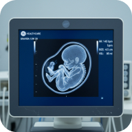 UltrasoundAbdominal, pelvic, or specific lumps and bumps
 Weight Loss (GLP-1)Pre-prescription blood tests, prescription, monitoring
- Picker text is unstyled: service titles are General Sans Semibold 15, descriptions Public Sans 12/16, city names General Sans 14, the month heading General Sans Semibold 16, and the ACTIVE pill is Public Sans SemiBold 9px, smaller than anything on the type scale.
- The city search box isn't the Search input component: it's 13px text, an 8px radius and a 1.5px
neutral-grey-200border, against the component's pill, 14px text and 1pxneutral-grey-400. - The Service and City pickers use a 16px radius with a shadow; the Date & time picker uses 12px with a sand border and no shadow.
Cards
Content cards for testimonials, stats, pricing, doctors, values and listings. Cards sit on surface-card with a 16px radius unless noted.
 Reviewer nameRole or context
"Review text goes here with the patient's testimonial about their experience."
- Pricing cards have square corners, unlike every other card (16px).
- Listing row's frame has collapsed to 100px wide in Figma, so its text wraps into a ~400px-tall column. The brand book shows it full width.
- The doctor name is raw General Sans Semibold 11/16, Curitt/Label's values without the style. The doctor photo is a grey placeholder in Figma.
- Testimonial cards use 28px padding and pricing cards 36px, both off the 4px grid. The "4.9★" stat and the testimonial stars use the ★ character.
Location card, location list item & map pin
How clinics are presented: a large card for location pages, a compact list item beside the map, and the map pins themselves. Hover the default location card.

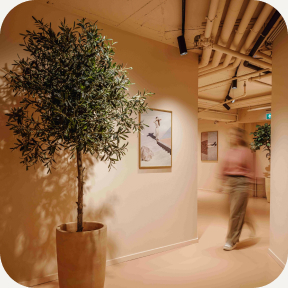 UtrechtUtrecht, SmakkelaarshoekSmakkelaarshoek 5, 3511 EC Utrecht
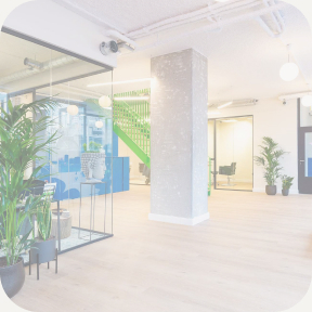 Rotterdam/The HagueRotterdam/The HagueOpening soon.
| Location card state | Treatment |
|---|---|
| Hover | sand-400 fill, shadow 0 4px 16px black 8% |
| Active | shadow 0 2px 4px black 4% |
| Selected | 2px accent-green ring |
| New location | photo at 20% opacity, single "I'm interested" button |
- The hover and active shadows, and the map pin shadow (black 12% on an 8px blur), are hand-set rather than the bound Curitt/Shadow styles.
- In the list item, the Directions button is too narrow for its label, which is clipped in the 368px card. The brand book lets the button and card grow to fit.
- The open and opening-soon list items use different border colours:
neutral-black-100andneutral-grey-100. - Location cards carry a hidden "Transport details" block; it's left out here.
Service item
A service row for listing pages: image left on desktop, stacked on tablet and mobile.
- The image is a raw
#CCCCCCplaceholder, the title is raw General Sans Medium 23/32 (H4's values, unbound), and the fill is bound tosurface/cardfrom the Colour collection rather than the semanticsurface-card. Figma has both, and components mix them.
Navigation
The site navbar, desktop and mobile, with its links, language picker and menu toggle.
- The CURITT wordmark is live text in HK Grotesk Medium 21px with 18% tracking, a typeface outside the system that isn't loaded anywhere. The brand book renders it in General Sans. It should become an SVG logo (Section 04 is still a stub), and Section 01's hero wordmark should then use the same asset.
- Desktop nav links are raw General Sans Semibold 11/16 with 1.5% tracking, where every other uppercase label uses 10%.
- Disabled nav links are
accent-sandat 50% opacity, which is nearly invisible on white. - Menu toggle icons are a raw grey (
#808080), not bound to a variable. - The language dropdown uses two hand-set shadows rather than a Curitt/Shadow style, and the desktop links sit 40px apart (no spacing token).
Section header & hero content
The two heading blocks that open a page section. Both align left, centre or right; the hero also has a spaced layout with the call to action pushed to the right. Sizes step down at tablet and mobile.
Prices from €99. No referral needed, booking takes two minutes.
Prices from €99. No referral needed, booking takes two minutes.
Prices from €99. No referral needed, booking takes two minutes.
Prices from €99. No referral needed, booking takes two minutes.
Prices from €99. No referral needed, booking takes two minutes.
- The kicker ("Section title") is
accent-signaturetext, the fill-only clay. It should beaccent-signature-text. - The tablet and mobile section headers use raw text (General Sans Medium 28/35 and 23/29, Public Sans 15/24 and 14/22) instead of Curitt styles, and the mobile header has 36px side padding.
- The hero stacks with a 28px gap on desktop and 17px on mobile, both off the 4px grid.
Feedback & utility
Small pieces used across the site and app: breadcrumb, tooltip, inline notifications, the cookie banner and the "AI summary" prompt.
- The cookie banner's "Reject non-essential" is a Ghost button overridden to white text; the Button set has no on-dark ghost.
- The tooltip, toasts and cookie banner use unstyled text (Public Sans 12 and 13, General Sans Semibold 14).
- The AI prompt uses ✳ and ◆ characters as stand-ins for the Claude and ChatGPT marks; its 9px glyphs are bound to
text-on-dark, a Figma variable the brand book didn't have (now--text-on-dark).
Discovery & content
Pieces from the services and results pages: FAQ, legal clause, panel tabs, filter chips, the biomarker search and row, the contact prompt, next-available slot chips and the service nav.
Question goes here?
Answer copy goes here. Keep it to two or three sentences so the list stays scannable.
Question goes here?
Answer copy goes here. Keep it to two or three sentences so the list stays scannable.
- Slot chips use
signal-live(#34C759, the iOS system green) for the status dot, a colour outside the brand palette. The day label isclay-600as text, the fill-only clay. - The dark slot chip and dark contact prompt get their colours by switching Figma's variable mode to Dark, where
surface-basebecomes near-black. The brand book has no equivalent "dark island" mode, so these specimens set the dark values directly. - Panel tabs (Public Sans Medium 15), filter chips, the search bar and biomarker row (Public Sans 13 and 16) and service nav labels (Public Sans 11) use unstyled text. Panel tabs, the search bar and the biomarker row also use hand-set paddings (22px, 28px, 9px) and shadows.
- The FAQ toggle and biomarker expand buttons are drawn as plain frames and a "+" character rather than icon buttons.
Service page
Building blocks of a service page: spec items, the who-it's-for list, what's included, and the example results report.
- The results preview contradicts Section 10. It labels results "Normal" on a green pill and "Low" on a clay pill, the colour-led status treatment Section 10 steers away from in favour of language like "within range" and "worth a conversation". This needs a decision before results UI is built.
- Ticks and dashes are text characters (✓ –) in circles rather than Lucide icons. Card titles and the spec value use raw General Sans Medium 18, 19 and 20.
- Inclusion cards use a 14px radius and 22px padding; the results preview 22/24/18px padding.
City request modal
Captures interest in a city without a clinic yet: a short form, then a confirmation. The form is live.
Want Curitt in your city?
Tell us where you'd like a clinic next. We'll email you when we open near you, and that's all we'll use your address for.Thanks, you're on the list.
We'll email you as soon as Curitt opens a clinic near you. Until then, our Amsterdam and Utrecht clinics are ready when you are.- The modal's inputs are a third input style: 54px tall, 12px radius, 16px text and a
neutral-grey-200border, unlike both the Text input component and the city search in the booking picker. - Its shadow (0 24px 48px, 16%) is hand-set, close to but not the same as Curitt/Shadow-lg. The consent checkbox is a plain frame, not the Checkbox component.
Service nav (mini)
A slim, sticky service switcher for service pages, with a blurred background in Figma.
Logo strip
A "trusted by" strip of company logos. Shown here as a layout only.
- The Figma strip uses Apple, ASML, NVIDIA, Siemens, Spotify, Airbnb and IBM logos. Third-party logos must come from each company's official assets and be used with their permission, so the brand book shows placeholders only.
- A "Trusted by teams at…" claim needs to be true and substantiated before it ships. Per principle 6 (Real, not staged), drop the strip if it isn't.
Library-wide notes
Patterns that repeat across the Figma library, worth fixing once at the source rather than component by component.
- Type drift: Figma has 31 text styles against the brand book's 12-step scale, and many components use raw, unstyled text (12, 14, 15, 17, 18, 19, 20px…). The extras are mirrored as component type tokens; decide whether to fold them into the scale or retire them.
- Clay as text:
accent-signature/clay-600is used for text in the booking bar, section header kicker and slot chips, but it's fill-only (3.4:1). Text should useaccent-signature-text. - Duplicate variables: the Colour and Semantic collections both define surfaces (
surface/baseandsurface-base,surface/cardandsurface-card), and components use both. Bind components to the semantic set only. - No radius or shadow discipline: there are no radius variables (radii of 6, 7, 8, 10, 12, 14, 16, 18, 20, 27px and pills all appear), and several shadows are hand-set instead of using the three Curitt/Shadow styles.
- Three input styles: the Text input component, the booking city search and the modal inputs all differ in height, radius, text size and border.
- Off-palette colours:
signal-live(#34C759) and the menu icon grey (#808080) aren't brand colours. - Wordmark: the navbar CURITT is live text in HK Grotesk, a typeface outside the system. It should be an SVG logo from Section 04.
Optional: Section Hero
A full-bleed image banner (.section-hero) available at the top of any section — dark gradient overlay, Curitt logomark and wordmark reversed in white, centred. Currently live on Section 01 (Introduction) as a placeholder gradient, pending real photography from the Section 08 shoot.
.hero-mark — Section 01's hero is running wordmark-only until one is supplied. Flagging rather than guessing at the shape.Use sparingly — Introduction and maybe one or two flagship sections at most, never on every section. The point is a considered moment, not a decorative pattern repeated down the sidebar.
<div class="section-hero" style="background-image: url('PHOTO_URL_HERE');">
  <div class="section-hero-overlay">
    <svg class="hero-mark"><!-- Open C logomark, white --></svg>
    <div class="hero-wordmark">CURITT</div>
  </div>
</div>
/* Full-bleed: breaks out of .content's horizontal padding (48px,
   exactly --space-2xl) rather than sitting inside it like body text.
   Match the negative margin to whatever .content's padding is. */
.section-hero {
  width: calc(100% + var(--space-2xl) * 2);
  margin-left: calc(var(--space-2xl) * -1);
  margin-right: calc(var(--space-2xl) * -1);
  height: 60vh;
  min-height: 400px;
  background-size: cover;
  background-position: center;
  position: relative;
  margin-bottom: var(--space-4xl);
}
.section-hero-overlay {
  position: absolute; inset: 0;
  background: linear-gradient(180deg, rgba(22,21,18,0.15) 0%, rgba(22,21,18,0.55) 100%);
  display: flex; flex-direction: column; align-items: center; justify-content: center;
  gap: var(--space-m);
}
.hero-wordmark {
  font-family: var(--headline); font-weight: 500;
  font-size: var(--text-h1); letter-spacing: 0.16em; color: #FFFFFF;
}
Clinic & Spatial Design — The Lookbook
Not startedWhat's fixed versus flexible per location, and the spatial and material brief for new clinics as Curitt expands.
Fixed: material palette, colour logic, typography in-clinic. Flexible: layout, given each building's constraints. To be developed as a standalone visual document, likely in Figma, and linked from here.
Print & Collateral
Not startedBusiness cards, letterheads, patient reports, giveaways, signage.
To be developed once the visual identity (Sections 04–07) is locked.
Advertising & Campaign Guidelines
Not startedDigital ads, billboards, social templates, KOAG/KAG compliance notes.
Governance
Not startedOwnership, how the system evolves, who approves exceptions.
Proposed owner: Johannes (Creative Director). Proposed process: exceptions or new additions get added here directly, with a short changelog rather than a separate approval thread.